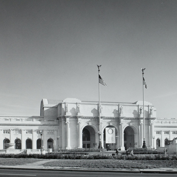
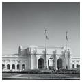
Railroad stations had no analogous building type in ancient architecture, so Daniel Burnham combined the triumphal arch and the public bath typologies to obtain a classical and meaningful image and to solve crucial interior circulation problems for Union Station. Triumphal arches were the gateways of Rome and bath complexes accommodated huge crowds constantly on the move. Burnham reordered the Arch of Constantine in his triple-arched entry, concentrating his iconographical program for the building here, which he entitled The Progress of Railroading. The entablature above six Ionic columns breaks forward to provide bases for 18-foot-tall allegorical figures by Louis Saint-Gaudens that represent Fire, Electricity, Freedom, Imagination, Agriculture, and Mechanics. Inscriptions in three central panels composed by Harvard president Charles Eliot reinforce the meaning of the sculpture, which elevates railroads to a status comparable to major cultural and historical institutions. Union Station was intended to represent the culmination of the emblematic program introduced at the Capitol in the 1820s when the push westward was seen as America's destiny. Railroads conquered the continent and recognition of this role, as well as their contributions to the country's great prosperity at the turn of the century, accounts for the architectural importance accorded Union Station. Although not erected until 1912, Burnham and Lorado Taft's Columbus Fountain, located on the plaza on the central axis, participates in this grandiloquent scheme. Columbus stands at the prow of his ship flanked by crouching figures representing the Old and New worlds. A globe supported by American eagles sits atop the entire composition. The fountain—the first element we encounter—symbolizes the link between the two continents while the station itself represents mastery of the North American continent.
This succinct and meaningful display of two fundamental facts of American history contributes to Union Station's greatness, but it might have existed on a building of lesser architectural merit. In its five-part organization Burnham established a hierarchy with the central portals dominant and the side arcades and end pavilions subordinate in scale, sculptural plasticity, and decorative (and thus emblematic) elaboration. This ordering gives clear spatial organization and a sense of compactness to a very large structure. The 626-foot extent of the facade's continuous vaulted loggia funnels people into either central or end doors. These arcades of Renaissance inspiration have two stories knit together by giant Ionic pilasters. Burnham maintained a kind of integrity in his eclecticism in that all the architectural detailing of the Renaissance-derived portion of the building is in Renaissance style and in the Roman-derived portion, Roman. The balustrades, for example, a Renaissance invention, mask the recessed attic on the wings alone. Throughout the building, the arcuated and trabeated systems of construction interweave, a central theme of Roman architecture that was passed on to the Renaissance. Articulation of each of the minor components of the facade relates to their individual functions. The width of the west pavilion arch is determined by its original function as a carriage entry; the corresponding east pavilion served as the state entrance to the presidential reception room.
The clarity of the facade's organization is carried over into the interiors. The barrel-vaulted roof, clearly visible from all approaches to the building, offers a preview of the location, shape, and size of the major interior spaces. Above the central portico, the attic provides the backdrop for the inscriptions and buttresses the reinforced concrete barrel vault of the central waiting room. Above the arcades, the attic stories mask low barrel vaults with skylights that originally lit the ticket lobby, on the west, and offices and the dining room, on the east. These roofs reinforce the major longitudinal axis implicit in the wide facade. Burnham's placement of solid geometric forms above a facade that is repeatedly penetrated by deep recesses reveals his highly developed feeling for the architectural effects of light and shade. These roof volumes seem to be covered by a tightly stretched thin membrane (actually reinforced concrete tiles), in contrast to the thickness of the layered walls below. White Vermont granite of a quality and appearance similar to marble, a veneer applied over a steel frame and brick core, perfectly complements the building's forms and surfaces.
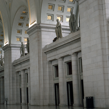
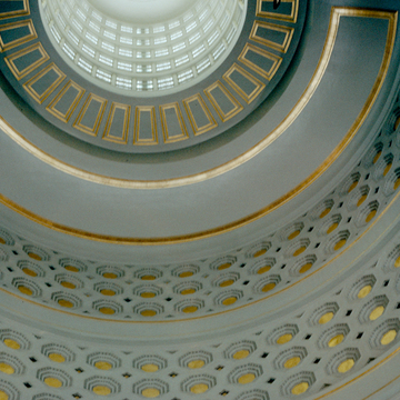
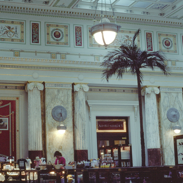
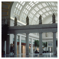
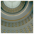
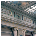
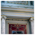
As one passes from the loggia into the waiting room, the logical route to the trains along the north-south central axis is evident, but it runs perpendicular to the central space, which contained all of the functions preparatory to boarding the trains. Here the three arches of the exterior are increased to five short barrel vaults with column screens below and thermal windows above. This arrangement is replicated opposite on the north wall, which opens onto the train concourse. Each barrel vault is set perpendicular to, and buttresses, the high, coffered elliptical vault (which is now gilded but was not when it was originally built) that runs along the dominant east-west axis. The intersecting spatial organization, scale (120 feet by 219 feet; 96 feet tall at the center), and articulation of the coffered vaults are patterned after the Baths of Diocletian in Rome. Column screens divided the waiting room from the ticket lobby and dining room. This open, light-filled interior has been maintained despite its present renovation into a shopping mall by the architects Benjamin Thompson Associates of Boston. The grand concourse (760 feet by 130 feet) was originally a skylit platform affording access to thirty-four trains whose individual platforms were attached to the back of the building. Unfortunately, this area has been poorly subdivided, with a sunken food hall and movie theaters below grade and a freestanding platform lifted above the concourse level (which still provides access to the trains). Comparison of this space-destroying arrangement (and its mundane detailing) with the greatness of Gae Aulenti's spatially exciting contemporaneous renovation of the Parisian train station, the Gare d'Orsay, into the Musée d'Orsay is a commentary on a culture dedicated to consumerism vis-à-vis one that extols—and consumes—its own cultural history. Large amounts of money were expended on gold leaf, rather than on architectural design that would enhance rather than diminish a great building, in order to convince the consumer that tenants of Union Station mall were specialty shops.
Starting in 1981, restoration efforts have aimed to bring the station back to its former glory and reverse several of the modernizing schemes. One of the first significant remodels included the 1988 elimination of the so-called “Pit” that served as the culminating slideshow experience of the National Visitor Center. The latter never attracted enough visitors due to issues with parking and was eventually disbanded. In its stead, a basement level was set up with an AMC theater and the floor was refitted with marble. In 2009, the theater was replaced with an expanded food court and a chain pharmacy. In 2015, the Union Station Redevelopment Corporation released the first ever Historic Preservation Plan. A year later, the organization pursued the restoration of the Main Hall, which involved the demolition of the Center Café and fountains. As the area more generally continues to embrace redevelopment and gentrification, Union Station will continue to experience both restoration and modernization efforts. In 2019, 36 statues of Roman Legionnaires in the Main Hall underwent their first cleaning in three decades; other planned efforts include the expansion and modernization of train tracks.

