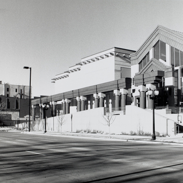
Here is Postmodernism at a glance, tinged with Moore's usual twists of humor. 10 Since every public building needs columns, he has provided a single row of them standing in front of the building. The three-layer entablature resting on the columns is broken here and there, as if to emphasize that this colonnade is a stage-set screen that has nothing to do with the building. The free-standing colonnade does succeed in establishing the building's civic presence overlooking Green Square Park. Behind this screen to the left are three connected pavilions, and a fourth which is a loading dock.
To the right is the glass “grand” entrance pavilion which poses between the new pavilions on the left and the remodeled Carnegie Library building on the right. In contrast to the others, the entrance pavilion has a tiered gable roof, and its placement to one side seems to hint that eventually the building will move over and replace the older building. Color, ranging from the black of the drumlike columns to shades of warm tan for the walls, is used to accentuate the elements of the building. Within, the entrance pavilion is carried up two floors to a glass roof, and a forest of tall, thin columns (should one call them of the “Byzantine order”?) greets the visitor. On exhibit one will find the works of a number of Midwest Prairie Regionalists of the 1930s, including Grant Wood, Thomas Hart Benton, and Marvin Cone.
Notes
Kirk Blunck, “Iowa Museum Opens,” Architecture 79 (February 1990): 24.

