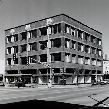
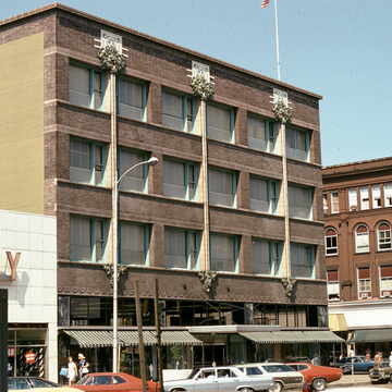
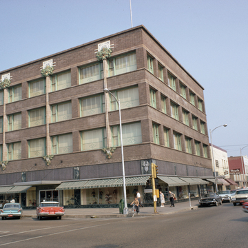
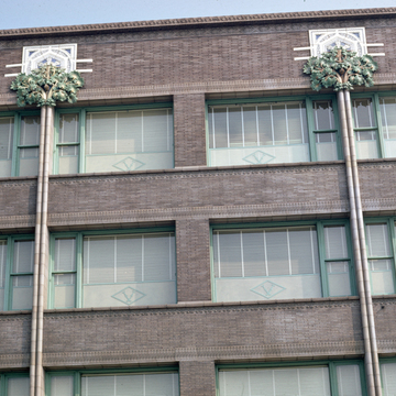
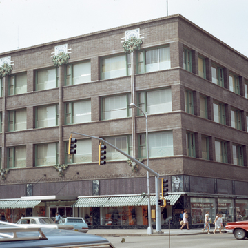
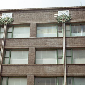
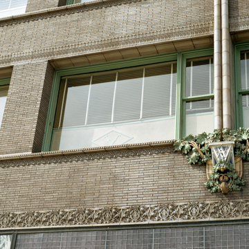
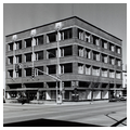
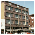
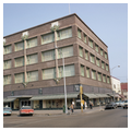
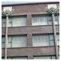
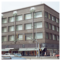
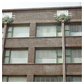
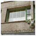
This is Louis Sullivan at his best. He took the theme of horizontality which he had used on the earlier Carson, Pirie, Scott Department Store building in Chicago (1899–1904) and applied it in a simplified fashion to the upper three floors of this building. As in the Carson, Pirie, Scott store, Sullivan treated the sidewalk-level first floor as a wide open space with large showcase windows. He penetrated down through the horizontal banded windows of the fourth through the second floors with three theatrical explorations of rich terracotta ornament. They seem to have been conceived as stylistic flowers: their stems grow from a stylized brick segment suggesting earth, and flowers burst forth at the top. The building exhibits an array of fascinating details, such as the surface play between the projecting horizontal band connecting the window sills and the flat, horizontal surface band that serves as a continuous header for the windows. In the upper window pattern on the Fifth Avenue side, Sullivan altered slightly the basic balanced symmetry of the repeated openings by using only one double-hung window on the left and then a single sheet of glass on the right.
As with Sullivan's late Prairie banks, the Van Allen Store indicates the vigor and inventiveness of the architect during his late years. The play of the rich projecting terracotta ornament (particularly the three flowerlike cartouches above the fourth-floor windows) against the plain horizontal brick surfaces of the building was a design theme that he utilized in a good number of his late buildings. A similar relationship of ornament to the building surfaces—reminiscent of the Churriguer-esque—is found in his Merchant's National Bank at Grinnell (1914), in his Home Building Association Bank (1914) at Newark, Ohio, and in his People's Savings and Loan Association Bank (1917–1918) at Sidney, Ohio.
The exterior of the Clinton building remains essentially intact. A few changes have come about, including the elimination of the small square Luxor Prism windows above the showcase windows, and the introduction of repeated dark signage within the lower sections of the upper three floors of windows. Plans are currently being made by the architect Crombie Taylor and others to adapt the building to some type of new community use.

