You are here
Library of Congress, John Adams Building
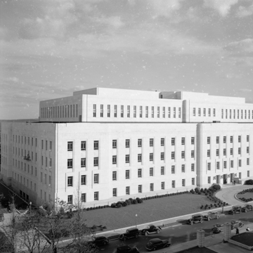
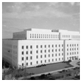
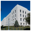
A major concern of the architects of the Library of Congress annex was the proper contextual relationship among the three library buildings occupying the two adjacent blocks bounded by East Capitol Street on the north and Independence and Pennsylvania avenues on the south. Institutionally, Pierson and Wilson's building is allied to Smithmeyer and Pelz's 1897 Library of Congress, but spiritually, it responds to Paul Philippe Cret's Folger Library, completed in 1932. The challenge was to mediate between two such disparate interpretations of the classical tradition yet create a building with its own architectural character. In their design the architects successfully fused elements from both buildings and added a modernized decorative vocabulary, largely the work of sculptor Lee Lawrie.
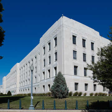
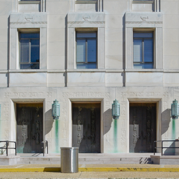
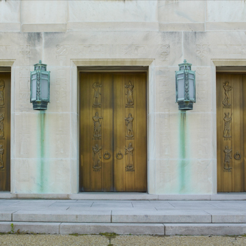
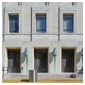
The volumetric organization of the John Adams Building is similar to that of the Thomas Jefferson Building (see CH12): a rectangle with corner and central pavilions linked by wide, fenestrated curtains terminated by a high recessed attic story. Like the Folger, it has both ceremonial and functional facades. The Independence Avenue entrance is treated in a traditional Beaux-Arts manner with controlled progression up and into the building and with important interior spaces (fifth-floor reading rooms) strung along the main axis. However, these basic organizational elements are overlaid by features derived from modernist and Art Deco vocabularies. These include planar wall surfaces, sunken window frames, and stylized decoration, mainly variants on the honeysuckle flower ornament popular in American architecture since the early nineteenth century. Vertically linked window bays alternate with narrow strips of marble-clad walls, a modern expression of the basic rhythm of peripteral temples that Cret had exploited as a salient design feature at the Folger. Pierson and Wilson also adopted Cret's use of an anthemion frieze set well below the cornice line in place of a traditional entablature.
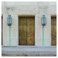
Materials—whether stone, metal, or plastic—are used in particularly elegant ways. The matte finish of the white Georgia marble and North Carolina pink granite on the exterior gives way to colorful and highly polished
The major spaces are all on the top floor; the monumental entry to them from the south is currently closed. The reading rooms are rectilinear with square columns creating recesses along the side walls. In addition to Art Deco detailing, these spaces are decorated with murals painted by Ezra Winter, showing friezes of Chaucer's Canterbury Pilgrims in the north reading room and scenes inspired by Thomas Jefferson's writings in the south reading room.
Writing Credits
If SAH Archipedia has been useful to you, please consider supporting it.
SAH Archipedia tells the story of the United States through its buildings, landscapes, and cities. This freely available resource empowers the public with authoritative knowledge that deepens their understanding and appreciation of the built environment. But the Society of Architectural Historians, which created SAH Archipedia with University of Virginia Press, needs your support to maintain the high-caliber research, writing, photography, cartography, editing, design, and programming that make SAH Archipedia a trusted online resource available to all who value the history of place, heritage tourism, and learning.

