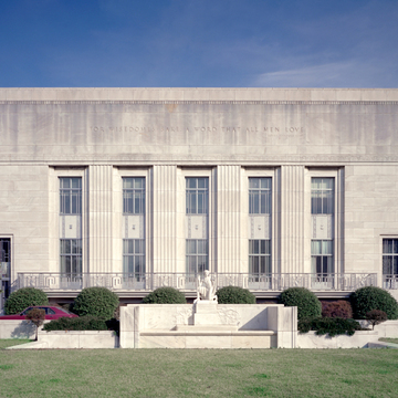
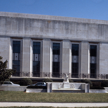
In its style, scale, and materials, the Folger Shakespeare Library mediates between the monumental Capitol complex and the domestic neighborhood of Capitol Hill. Cret's design was for a low horizontal building to contain the library, an exhibition gallery, and a theater for the presentation of Shakespeare's plays in their original staging, and for lectures or concerts. He placed the library in the center of a U-shaped arrangement behind the gallery that runs nearly the width of the East Capitol Street facade. The east wing contains the theater and the west wing administrative offices and access to the library. Entries at both ends of the main facade serve the respective wings and allow access to the gallery. The east facade is a blank wall broken only by masks of comedy and tragedy. The west facade facing the Capitol is treated more prominently, as the main approach to the building is from the west, and both this and the East Capitol Street facade are often seen together.
A broad attic story broken only by inscriptions, a slight recession at the top, and an entablature of shallowly incised abstract classical ornament at the bottom emphatically cap the building. To achieve a harmonious balance between solid and void, Cret grouped nine window bays on the north facade and five on the west in the center of horizontal fields. In his fusion of historicist vocabulary with modernist forms, Cret emphasized the trabeated system of classical architecture by repeating pilasters with all intermediate openings emphatically rectilinear. Only suggestions of traditional architectural decoration have survived: fluting, friezes, and moldings associated with capitals and entablatures are stylized versions of the original forms. Cret transferred most of the decorative ornament from the walls to window and door screens, thus reinterpreting the traditional interplay of light and shadow across wall surfaces. Aluminum screens of Art Deco design cast ever-changing linear geometric patterns on interior surfaces equally geometric but Elizabethan in origin. The idealized naturalism of John Gregory's eight high-relief panels (1932) illustrating scenes from Shakespeare's most celebrated plays offers an interesting contrast to the stylized rectilinearity of the screens set against the windows just above them. On a classical building one expects sculptural panels to be associated with the entablature, but Cret brought them to ground level where they can be easily seen and interpreted. In conjunction with the quotations from Shakespeare in the attic and Brenda Putnam's Puck Fountain (1932) on the west front, these narrative panels announce the building's purpose, a remnant of the Beaux-Arts tradition in which Cret was trained.
The contrast between exterior and interior is one of historical style rather than architectural quality. The clarity of composition, consistency of scale of decorative elements, and craftsmanlike manner in which the materials are put together—whether the large marble panels on the exterior or the Elizabethan strapwork plaster ceiling of the gallery—attest to an architectural mind able to grapple with apparent inconsistencies of the three Western languages of architecture employed here and reconcile them into a unified whole. Cret offered a method by which contemporary architectural concerns could be integrated into historical architectural environments as diverse as those he found on Capitol Hill. The beautiful and sensitive 1985 addition to the library visible on the south facade is the work of the Washington firm Hartman-Cox.


