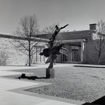
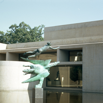
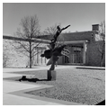
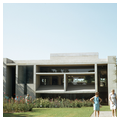
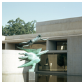
Nationally, the Des Moines Art Center is undoubtedly the best-known building in the city. On three separate occasions, over a period of four decades, the museum trustees have engaged major architects to design and add to their building. Each of these episodes pointedly illustrates not only changes in architectural fashion, but attitudes toward nature, the art of architecture, and the art found in and around the building. The engaging of Eliel Saarinen for the initial building was a logical choice for the time. Saarinen's Cranbrook Museum and Library (1940–1943) at Bloomfield Hills, Michigan, was without question the best-known modern museum building in the country. And although not built, Eliel and Eero Saarinen's winning scheme for the Smithsonian Art Gallery in Washington, D.C., of 1939, received extensive press coverage. As with all of his work at Cranbrook, Eliel Saarinen (in conjunction with Thomas Church) produced for Des Moines a building that let the park and nature predominate. The oneand two-story building clad in dolomite stone was placed on the south slope of a hill, almost hidden from Grand Avenue. A gentle curved drive leads around the hilltop to a modestsized parking area. The unity of the building with nature is immediately apparent at the entrance where one looks through an opposite glass wall to a pool court with a Carl Milles sculpture, Pegasus and Bellerophon. This court in turn is related to Church's rose garden which meanders down the hill into the forested park. Within, the principal galleries form a “U” around the court and open onto it via windows and glass doors. An important element in Saarinen's scheme was the education wing where children as well as adults could actively participate in art. Saarinen wrote in 1949 of his intent for the building: “To build up an atmosphere of art creation about the whole Art Center, and to create a place of interest for all strata of the population, old and young—through the young.”
22
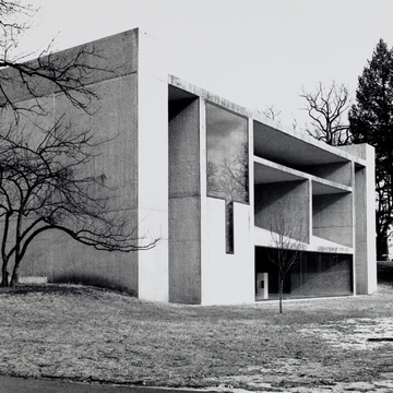
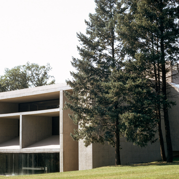
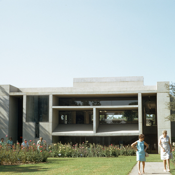
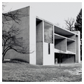
In 1968 the trustees again surveyed the museum scene and selected another well-known figure, I. M. Pei. Pei's firm added 18,000 square feet to the Saarinen building. That addition followed the International style's predilection for discarding the old for the new, i.e., anti-contextualism. Pei created a Brutalist exposed concrete building with the pattern of the board forms revealed, somewhat reminiscent of the work of Louis I. Kahn.
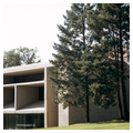
The next phase of asserting the new was the 1982–1984 addition by Richard Meier. His product was what one has come to expect of his work—an assertiveness upscaled to open exhibitionism. Meier's wing, which poses as one of his modernist houses enlarged in scale, is plunked right on top of the hill, not only pushing the earlier Saarinen and Pei designs to the side but destroying the sense of this being a public park. If one grants Meier's borrowed modernist imagery and ideology, then the presence of this shimmering white design clearly visible from Grand Avenue is a success. Inside the building, both the Pei and the Meier additions are at best fitted awkwardly into the spaces provided by Saarinen.
Notes

